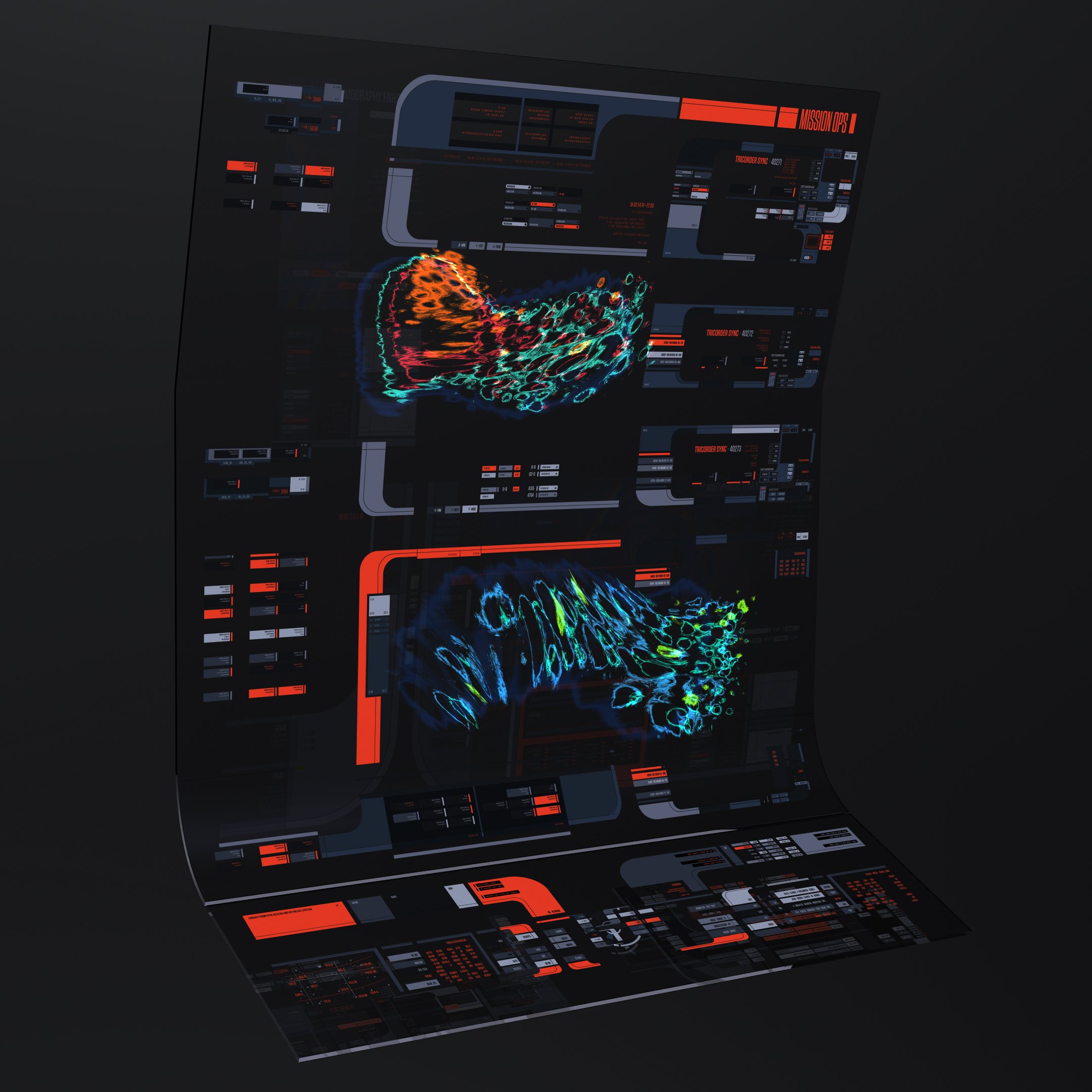
25th Century LCARS
Season One
It’s 2018 and Twisted Media had just received confirmation that we would be designing the interfaces for Star Trek: Picard. I remember the moment Chris Kiefer told me we got it and my mind started racing. No indication about plot, characters, or what alien races we might see, but I knew one thing: we would need an updated LCARS. Thankfully this coincided with our holiday hiatus, so during the last three weeks of December 2018 I started concepting what LCARS might look like in the 25th century.
Teenage Andrew, high school yearbook, 1997
What kind of Star Trek has me doing this instead of Michael Okuda?"
A quick aside about me: my love for Star Trek runs deep.
Growing up, my mother refused to allow me to watch Star Wars because “it had the word ‘war’ in the title”, but there was no prohibition on Trek. The fact of the matter was, neither of my parents had any interest in science fiction. To this day they express some surprise that adults “actually watch this stuff”. This saddens me greatly, as I believe the fundamental exercise of asking “what if” helps us immensely with the real world questions of “what is”, and “what can be”.
Even before TNG I would watch reruns of the original and animated series. I am so grateful they were part of my childhood. As I got older my obsession grew, and I would cary my copy of the Star Trek The Next Generation: Technical Manual around with me. There was something about that level of detail in a fictional universe that captivated me.
I remember first seeing the interview where Michael Okuda described a fan’s question of how the transporter’s Heisenberg compensator works, to which he replied “very well, thank you.” and thinking how incredibly cool that guy was. It would take me a bit to put together he’s the guy who wrote that manual I love!
So as you might imagine, my first question when I learned we would be working on Star Trek was “Will Michael Okuda be involved?”. I got no answer.
This was very concerning to me.
What kind of Star Trek has me doing this instead of Michael Okuda?
Season one palette
Over the next few months there was a gradual shift toward cooler blues in response to notes from Chris Kieffer and Martin Garner, who provided playback for all of season one.
I liked this change at the time, but I was also very aware of how slippery the slope is toward blue in. any fictional user interface (FUI). Having worked as a FUI designer for some time I can tell you, it’s like driving with misaligned steering column, any time you take your hand off the wheel it drifts toward blue. This episode of 99% Invisible came out two years before I entered the field: Future Screens are Mostly Blue.
This is also exacerbated by the way video playback appears in camera, to say nothing of how the final frame is color graded.
The final Season One palette
Star Trek: Picard, CBS Studios 2020
Picard’s Desk Holo
For the holographic interface in Picard’s (holographic) study on the Sirena, we wanted to do a callback to the last time we saw LCARS used, in Star Trek: Nemesis. The idea being that Picard would probably prefer an older version of the interface, and the technology at this point would be easily configurable to whatever interface you’re most comfortable with.
Also they said they wanted it blue.
Star Trek: Nemesis, Paramount Pictures 2002
Much of the UI design work for Season One was on the bridge of La Sirena, and I was surprised to find Admirl Clancey’s office was one of the only times 25th century LCARS would be seen that season, along with some quick glimpses of the Zheng He.
Season Two
After spending an entire season creating 3D holographic interfaces I was excited take what I’d learned on La Sirena and Romulan interfaces and apply that to LCARS. I quickly set upon developing lookdev concepts for how LCARS could live in 3D space.
LCARS in 3D
The Return of Michael Okuda
At the beginning of season two Dave Blass brought in Michael Okuda for a series of consultations with the team, which at the time was myself as the lead designer, Chris Kieffer guidance and oversight, and Casey Feldt as coordinator and project manager.


